BootStrap
[TOC]

一、Bootstrap
2.1 Bootstrap概述
- Bootstrap 是一个用于快速开发 Web 应用程序和网站的前端框架。Bootstrap 是基于 HTML、CSS、JAVASCRIPT 的。Bootstrap 是由 Twitter 的 Mark Otto 和 Jacob Thornton 开发的。Bootstrap 是 2011 年八月在 GitHub 上发布的开源产品。
- Boostrap特点: 移动设备优先:自 Bootstrap 3 起,框架包含了贯穿于整个库的移动设备优先的样式。
- 浏览器支持:
- 所有的主流浏览器都支持 Bootstrap。
- Internet Explorer Firefox Opera Google Chrome Safari。
- 容易上手:只要您具备 HTML 和 CSS 的基础知识,您就可以开始学习 Bootstrap。
- 响应式设计:Bootstrap 的响应式 CSS 能够自适应于台式机、平板电脑和手机。
2.2 响应式页面案例
- 需求:
- 创建一套页面!根据上网设备的不同自动调节显示的效果!
- m.taobao.com
- taobao.com
- Bootstrap的使用步骤:
- 下载bootstrap:https://v3.bootcss.com/
- 导入bootstrap.css文件
- 导入jquery.js
- 导入bootstrap.js
- 将所有的内容放到布局容器中
.container 类用于固定宽度并支持响应式布局的容器。
	<div class="container">
		...
	</div>
.container-fluid 类用于 100% 宽度,占据全部视口(viewport)的容器。
	<div class="container-fluid">
		...
	</div>
2.3 Bootstrap的组成
- 全局css的样式 排版 字体 段落对齐 按钮 图片
- 组件
- js插件
2.4 栅格系统
2.4.1 什么是栅格系统
12栅格系统 为什么不是11,13,5栅格系统?
1 -12
2-6
3-4
4-3
6-2
12-1
- Bootstrap 提供了一套响应式、移动设备优先的流式网格系统,随着屏幕或视口(viewport)尺寸的增加,系统会自动分为最多12列。
- 注意: Bootstrap将每一行分成12份!
- Bootstrap 提供了一套响应式、移动设备优先的流式栅格系统,随着屏幕或视口(viewport)尺寸的增加,系统会自动分为最多12列。它包含了易于使用的预定义类,还有强大的mixin 用于生成更具语义的布局。
- 栅格系统用于通过一系列的行(row)与列(column)的组合来创建页面布局,你的内容就可以放入这些创建好的布局中。下面就介绍一下 Bootstrap 栅格系统的工作原理:
- “行(row)”必须包含在 .container (固定宽度)或 .container-fluid (100% 宽度)中,以便为其赋予合适的排列(aligment)和内补(padding)。
- 通过“行(row)”在水平方向创建一组“列(column)”。
- 你的内容应当放置于“列(column)”内,并且,只有“列(column)”可以作为行(row)”的直接子元素。
- 类似 .row 和 .col-xs-4 这种预定义的类,可以用来快速创建栅格布局。Bootstrap 源码中定义的 mixin 也可以用来创建语义化的布局。
- 通过为“列(column)”设置 padding 属性,从而创建列与列之间的间隔(gutter)。通过为 .row 元素设置负值 margin 从而抵消掉为 .container 元素设置的 padding,也就间接为“行(row)”所包含的“列(column)”抵消掉了padding。
- 负值的 margin就是下面的示例为什么是向外突出的原因。在栅格列中的内容排成一行。
- 栅格系统中的列是通过指定1到12的值来表示其跨越的范围。例如,三个等宽的列可以使用三个 .col-xs-4 来创建。如果一“行(row)”中包含了的“列(column)”大于 12,多余的“列(column)”所在的元素将被作为一个整体另起一行排列。
- 栅格类适用于与屏幕宽度大于或等于分界点大小的设备 , 并且针对小屏幕设备覆盖栅格类。 因此,在元素上应用任何 .col-md-* 栅格类适用于与屏幕宽度大于或等于分界点大小的设备 , 并且针对小屏幕设备覆盖栅格类。 因此,在元素上应用任何 .col-lg-*
2.4.2 媒体查询功能
- 判断是什么上网设备
- 小屏幕(平板,大于等于 768px) @media (min-width: @screen-sm-min)
- 中等屏幕(桌面显示器,大于等于 992px)@media (min-width: @screen-md-min)
- 大屏幕(大桌面显示器,大于等于 1200px)@media (min-width: @screen-lg-min) { ... } col-lg-2
- 大屏幕 大于1200 col-lg-2
- 中屏幕 大于992<1200 col-md-3
- 小屏幕 大于768<922 col-sm-6
- 最小屏 小于768 col-xs-12
- 超小屏幕 手机 (<768px)
- 小屏幕 平板 (≥768px)
- 中等屏幕 桌面显示器 (≥992px)
- 大屏幕 大桌面显示器 (≥1200px)
- 栅格系统行为 总是水平排列 ,开始是堆叠在一起的,当大于这些阈值时将变为水平排列
- .container 最大宽度 None (自动) 750px 970px 1170px
- 类前缀 .col-xs- .col-sm- .col-md- .col-lg-
- 可以class中拼接多个列数限制
2.5 排版
标题: HTML 中的所有标题标签,h1 到 h6 均可使用。另外,还提供了 .h1 到 .h6 类,为的是给内联(inline)属性的文本赋予标题的样式。
<h1>我是h1</h1>我是跟随者
<!-- 要写成行内快-->
<span class="h1">我是h1</span>我是跟随者
对齐:通过文本对齐类,可以简单方便的将文字重新对齐。
<p class="text-left">Left aligned text.</p>
<p class="text-center">Center aligned text.</p>
<p class="text-right">Right aligned text.</p>
<p class="text-justify">Justified text.</p>
<p class="text-nowrap">No wrap text.</p>
改变大小写:text-lowercase 或 text-uppercase 或 text-capitalize
<p class="text-uppercase">Uppercased text.</p>
2.6 表格
- table 表格
- table-striped 表格隔行变色
- table-hover 悬浮变色
<table class="table">
    ...
</table>
行状态:通过这些状态类可以为行或单元格设置颜色。
| class类名 | 描述 |
|---|---|
| .active | 鼠标悬停在行或单元格上时所设置的颜色 |
| .success 绿色 | 标识成功或积极的动作 |
| .info 蓝色 | 标识普通的提示信息或动作 |
| .warning 黄色 | 标识警告或需要用户注意 |
| .danger 红色 | 标识危险或潜在的带来负面影响的动作 |
2.7 表单【重点】
- 元素都将被默认设置宽度属性为 width: 100%;将 label 元素和前面提到的控件包裹在 .form-group 中可以获得最好的排列。
- 单独的表单控件会被自动赋予一些全局样式。所有设置了 .form-control 类的 input、textarea 和 select标签
- 把标签和控件放在一个带有 class .form-group 的 div 中。这是获取最佳间距所必需的。
- 向所有的文本元素 input、textarea 和 select 标签 添加 class ="form-control" 。
- form-group 会将label和input上下排列 。
- form-control 会自动将input填充满屏幕 并添加点击高亮效果。
<!-- 表单元素 form input 搜集用户信息的 -->
<form action="" class="">
    <!-- 1、form 加样式 form-group 表单组 -->
    <div class="form-group">
        <label for="username">输入用户名</label>
        <!-- input 加样式 form-control 表单组 -->
        <input type="text" class="form-control" id="username">
    </div>
    <div class="form-group">
        <label for="password">输入密码</label>
        <input type="password" class="form-control" id="password">
    </div>

    <div class="checkbox">
        <label><input type="checkbox"> Check me out</label>
    </div>
    <input type="submit" class="btn btn-success" value="登录">
</form>
内联表单:为 form元素添加 .form-inline 类可使其内容左对齐并且表现为 inline-block 级别的控件。只适用于视口(viewport)至少在 768px 宽度时(视口宽度再小的话就会使表单折叠)。
<form action="" class="form-inline">
    <!-- 1、form 加样式 form-group 表单组 -->
    <div class="form-group">
        <label for="username">输入用户名</label>
        <input type="text" class="form-control" id="username">
    </div>
    <div class="form-group">
        <label for="password">输入密码</label>
        <input type="password" class="form-control" id="password">
    </div>

    <div class="checkbox">
        <label><input type="checkbox"> Check me out</label>
    </div>
    <input type="submit" class="btn btn-success" value="登录">
</form>
水平表单:通过为表单添加 .form-horizontal 类,并联合使用 Bootstrap 预置的栅格类,可以将 label 标签和控件组水平并排布局。这样做将改变 .form-group 的行为,使其表现为栅格系统中的行(row),因此就无需再额外添加 .row 了。
<form action="" class="form-horizontal">
    <!-- 1、form 加样式 form-group 表单组 独占一行 -->
    <div class="form-group">
        <!-- label 占屏幕的 2/12 -->
        <label for="username" class="col-sm-2 text-right">输入用户名</label>
        <!-- input 站屏幕的 10/12 -->
        <div class="col-sm-6">
            <input type="text" class="form-control" id="username">
        </div>
    </div>
    <div class="form-group">
        <label for="password" class="col-sm-2 text-right">输入密码</label>
        <div class="col-sm-6">
            <input type="password" class="form-control" id="password">
        </div>
    </div>

    <div class="checkbox">
        <label><input type="checkbox"> Check me out</label>
    </div>
    <!-- col-sm-offset-4  向右偏移4份 总共一行12份-->
    <!-- col-sm-offset-6  向右偏移4份-->
    <div class="col-sm-offset-4">
        <input type="submit" class="btn btn-success" value="登录">
    </div>
</form>
完整案例
<!DOCTYPE html>
<html lang="en">

<head>
    <meta charset="UTF-8">
    <meta http-equiv="X-UA-Compatible" content="IE=edge">
    <meta name="viewport" content="width=device-width, initial-scale=1.0">
    <title>BootStrap表单</title>
    <!-- 注意js文件引入的顺序,bootstrap依赖jquery -->
    <script src="./js/jquery-3.4.1.min.js"></script>
    <script src="./js/bootstrap.js"></script>
    <link rel="stylesheet" href="./css/bootstrap.css">
</head>

<body>
    <!-- 表单元素 form input 搜集用户信息的 -->
    <form action="" class="">
        <!-- 1、form 加样式 form-group 表单组 -->
        <div class="form-group">
            <label for="username">输入用户名</label>
            <!-- input 加样式 form-control 表单组 -->
            <input type="text" class="form-control" id="username">
        </div>
        <div class="form-group">
            <label for="password">输入密码</label>
            <input type="password" class="form-control" id="password">
        </div>

        <div class="checkbox">
            <label><input type="checkbox"> Check me out</label>
        </div>
        <input type="submit" class="btn btn-success" value="登录">
    </form>

    <hr />

    <form action="" class="form-inline">
        <!-- 1、form 加样式 form-group 表单组 -->
        <div class="form-group">
            <label for="username">输入用户名</label>
            <input type="text" class="form-control" id="username">
        </div>
        <div class="form-group">
            <label for="password">输入密码</label>
            <input type="password" class="form-control" id="password">
        </div>

        <div class="checkbox">
            <label><input type="checkbox"> Check me out</label>
        </div>
        <input type="submit" class="btn btn-success" value="登录">
    </form>

    <hr />

    <form action="" class="form-horizontal">
        <!-- 1、form 加样式 form-group 表单组 独占一行 -->
        <div class="form-group">
            <!-- label 占屏幕的 2/12 -->
            <label for="username" class="col-sm-2 text-right">输入用户名</label>
            <!-- input 站屏幕的 10/12 -->
            <div class="col-sm-6">
                <input type="text" class="form-control" id="username">
            </div>
        </div>
        <div class="form-group">
            <label for="password" class="col-sm-2 text-right">输入密码</label>
            <div class="col-sm-6">
                <input type="password" class="form-control" id="password">
            </div>
        </div>

        <div class="checkbox">
            <label><input type="checkbox"> Check me out</label>
        </div>
        <!-- col-sm-offset-4  向右偏移4份 总共一行12份-->
        <!-- col-sm-offset-6  向右偏移4份-->
        <div class="col-sm-offset-4">
            <input type="submit" class="btn btn-success" value="登录">
        </div>
    </form>

</body>

</html>
小挂件 Addon
案例: 显示带引导的
<form action="" class="form-horizontal">
    <!-- 1、form 加样式 form-group 表单组 独占一行 -->
    <div class="form-group">
        <!-- label 占屏幕的 2/12 -->
        <label for="username" class="col-sm-2 text-right">输入用户名</label>
        <!-- input 站屏幕的 10/12 -->
        <div class="col-sm-6">
            <div class="input-group">
                <div class="input-group-addon">$</div>
                <input type="text" class="form-control" id="username">
                <div class="input-group-addon">.00</div>
            </div>

        </div>
    </div>
    <div class="col-sm-offset-4">
        <input type="submit" class="btn btn-success" value="登录">
    </div>
</form>
通过将 .checkbox-inline 或 .radio-inline 类应用到一系列的多选框(checkbox)或单选框(radio)控件上,可以使这些控件排列在一行。
<label class="checkbox-inline">
    <input type="checkbox" id="inlineCheckbox1" value="option1"> 1
</label>
<label class="checkbox-inline">
    <input type="checkbox" id="inlineCheckbox2" value="option2"> 2
</label>
<label class="checkbox-inline">
    <input type="checkbox" id="inlineCheckbox3" value="option3"> 3
</label>


<label class="radio-inline">
    <input type="radio" name="sex" id="inlineRadio1" value="option1"> 男
</label>
<label class="radio-inline">
    <input type="radio" name="sex" id="inlineRadio2" value="option2"> 女
</label>
<label class="radio-inline">
    <input type="radio" name="sex" id="inlineRadio3" value="option3"> 未知
</label>
下拉列表
<select class="form-control">
    <option>1</option>
    <option>2</option>
    <option>3</option>
    <option>4</option>
    <option>5</option>
</select>

<select multiple class="form-control">
    <option>1</option>
    <option>2</option>
    <option>3</option>
    <option>4</option>
    <option>5</option>
</select>
带分割线的下拉框
<div class="btn-group">
    <button id="show" type="button" class="btn btn-danger">Action</button>
    <button type="button" class="btn btn-danger dropdown-toggle" data-toggle="dropdown">
        <span class="caret"></span>
    </button>
    <ul id="ul" class="dropdown-menu">
        <li><a href="#">Action</a></li>
        <li><a href="#">Another action</a></li>
        <li><a href="#">Something else here</a></li>
        <li role="separator" class="divider"></li>
        <li><a href="#">Separated link</a></li>
    </ul>
</div>
<div class="btn-group">
    <button id="show" type="button" class="btn btn-danger">Action</button>
    <button type="button" class="btn btn-danger dropdown-toggle" data-toggle="dropdown"><span class="glyphicon glyphicon-hand-down"></span></button>

    <ul class="dropdown-menu">
        <li><a href="#">选项1</a></li>
        <li><a href="#">选项2</a></li>
        <li><a href="#">选项3</a></li>
        <li><a href="#">选项4</a></li>
    </ul>
</div>
静态控件
<form class="form-horizontal">
    <div class="form-group">
        <label class="col-sm-2 control-label">Email</label>
        <div class="col-sm-10">
            <p class="form-control-static">email@example.com</p>
        </div>
    </div>
    <div class="form-group">
        <label for="inputPassword" class="col-sm-2 control-label">Password</label>
        <div class="col-sm-10">
            <input type="password" class="form-control" id="inputPassword" placeholder="Password">
        </div>
    </div>
</form>
Bootstrap 对表单控件的校验状态,如 error、warning 和 success 状态,都定义了样式。使用时,添加 .has-warning、.has-error 或 .has-success 类到这些控件的父元素即可。
任何包含在此元素之内的 .control-label、.form-control 和 .help-block 元素都将接受这些校验状态的样式。
<div class="form-group has-success">
    <label class="control-label" for="inputSuccess1">Input with success</label>
    <input type="text" class="form-control" id="inputSuccess1" aria-describedby="helpBlock2">
    <span id="helpBlock2" class="help-block">A block of help text that breaks onto a new line and may extend beyond one line.</span>
</div>

<div class="form-group has-warning">
    <label class="control-label" for="inputWarning1">Input with warning</label>
    <input type="text" class="form-control" id="inputWarning1">
</div>

<div class="form-group has-error">
    <label class="control-label" for="inputError1">Input with error</label>
    <input type="text" class="form-control" id="inputError1">
</div>

<div class="has-success">
    <div class="checkbox">
        <label>
            <input type="checkbox" id="checkboxSuccess" value="option1">
            Checkbox with success
        </label>
    </div>
</div>

<div class="has-warning">
    <div class="checkbox">
        <label>
            <input type="checkbox" id="checkboxWarning" value="option1">
            Checkbox with warning
        </label>
    </div>
</div>

<div class="has-error">
    <div class="checkbox">
        <label>
            <input type="checkbox" id="checkboxError" value="option1">
            Checkbox with error
        </label>
    </div>
</div>
添加额外的图标
你还可以针对校验状态为输入框添加额外的图标。只需设置相应的 .has-feedback 类并添加正确的图标即可。
反馈图标(feedback icon)只能使用在文本输入框 <input class="form-control"> 元素上。
需要导入font字体库
<div class="form-group has-success has-feedback">
    <label class="control-label" for="inputSuccess2">Input with success</label>
    <input type="text" class="form-control" id="inputSuccess2" aria-describedby="inputSuccess2Status">
    <span class="glyphicon glyphicon-ok form-control-feedback" aria-hidden="true"></span>
    <span id="inputSuccess2Status" class="sr-only">(success)</span>
</div>
2.8 按钮
class = btn 将任何东西变成按钮 需要配合 btn-default a标签也可以
1.按钮颜色
<!-- Standard button -->
<button type="button" class="btn btn-default">(默认样式)Default</button>

<!-- Provides extra visual weight and identifies the primary action in a set of buttons -->
<button type="button" class="btn btn-primary">(首选项)Primary</button>

<!-- Indicates a successful or positive action -->
<button type="button" class="btn btn-success">(成功)Success</button>

<!-- Contextual button for informational alert messages -->
<button type="button" class="btn btn-info">(一般信息)Info</button>

<!-- Indicates caution should be taken with this action -->
<button type="button" class="btn btn-warning">(警告)Warning</button>

<!-- Indicates a dangerous or potentially negative action -->
<button type="button" class="btn btn-danger">(危险)Danger</button>

<!-- Deemphasize a button by making it look like a link while maintaining button behavior -->
<button type="button" class="btn btn-link">(链接)Link</button>

2.成组button
<div class="btn-group" data-toggle="buttons">
    <label class="btn btn-primary">
        <input type="radio" name="options" id="option1"> 选项 1
    </label>
    <label class="btn btn-primary">
        <input type="radio" name="options" id="option2"> 选项 2
    </label>
    <label class="btn btn-primary">
        <input type="radio" name="options" id="option3"> 选项 3
    </label>
</div>
需要让按钮具有不同尺寸吗?使用 .btn-lg、.btn-sm 或 .btn-xs 就可以获得不同尺寸的按钮
<p>
    <button type="button" class="btn btn-primary btn-lg">(大按钮)Large button</button>
    <button type="button" class="btn btn-default btn-lg">(大按钮)Large button</button>
</p>
<p>
    <button type="button" class="btn btn-primary">(默认尺寸)Default button</button>
    <button type="button" class="btn btn-default">(默认尺寸)Default button</button>
</p>
<p>
    <button type="button" class="btn btn-primary btn-sm">(小按钮)Small button</button>
    <button type="button" class="btn btn-default btn-sm">(小按钮)Small button</button>
</p>
<p>
    <button type="button" class="btn btn-primary btn-xs">(超小尺寸)Extra small button</button>
    <button type="button" class="btn btn-default btn-xs">(超小尺寸)Extra small button</button>
</p>
- 按钮组:把一系列的.btn按钮放入.btn-group。
- btn-group 内部嵌套 btn
<div class="btn-group" role="group" aria-label="...">
  <button type="button" class="btn btn-default">Left</button>
  <button type="button" class="btn btn-default">Middle</button>
  <button type="button" class="btn btn-default">Right</button>
</div>
按钮工具栏:把一组 div class="btn-group" 组合进一个 div class="btn-toolbar" 中就可以做成更复杂的组件
<div class="btn-toolbar" role="toolbar" aria-label="...">
  <div class="btn-group" role="group" aria-label="...">...</div>
  <div class="btn-group" role="group" aria-label="...">...</div>
  <div class="btn-group" role="group" aria-label="...">...</div>
</div>
尺寸 :只要给 .btn-group 加上 .btn-group-* 类,就省去为按钮组中的每个按钮都赋予尺寸类了,如果包含了多个按钮组时也适用。
<div class="btn-group btn-group-lg" role="group" aria-label="...">...</div>
<div class="btn-group" role="group" aria-label="...">...</div>
<div class="btn-group btn-group-sm" role="group" aria-label="...">...</div>
<div class="btn-group btn-group-xs" role="group" aria-label="...">...</div>
2.9 图片形状
- 响应式图片随着窗体大小改变大小, img src="img/6.png" class="img-responsive" alt="Responsive image"
- 通过为 img 元素添加以下相应的类,可以让图片呈现不同的形状。
<img src="..." alt="..." class="img-rounded">
<img src="..." alt="..." class="img-circle">
<img src="..." alt="..." class="img-thumbnail">
<img src="..." alt="..." class="img-responsive">
2.10 导航栏
data-toggle="tab"
标签式导航栏
<ul class="nav nav-tabs">
    <li role="presentation" class="active"><a href="#" data-toggle="tab">Home</a></li>
    <li role="presentation"><a href="#" data-toggle="tab">Profile</a></li>
    <li role="presentation"><a href="#" data-toggle="tab">Messages</a></li>
</ul>

<div class="tab-content">
    <div class="tab-pane fade in active" id="h5">
        <p>Html5最近比较火</p>
    </div>
    <div class="tab-pane fade" id="java">
        <p>java是高级语言,是最好的语言</p>
    </div>
    <div class="tab-pane fade" id="android">
        <p>android是最受大众欢迎的智能机品牌</p>
    </div>
</div>
胶囊导航
<ul class="nav nav-pills ">
    <li class="active"><a href="#h5" data-toggle="tab">HTML5</a></li>
    <li><a href="#java" data-toggle="tab">JAVAEE</a></li>
    <li><a href="#android" data-toggle="tab">ANDROID</a></li>
</ul>
<div id="myTabContent" class="tab-content">
    <div class="tab-pane fade in active" id="h5">
        <p>Html5最近比较火</p>
    </div>
    <div class="tab-pane fade" id="java">
        <p>java是高级语言,是最好的语言</p>
    </div>
    <div class="tab-pane fade" id="android">
        <p>android是最受大众欢迎的智能机品牌</p>
    </div>
</div>
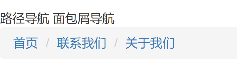
路径导航 面包屑导航
面包屑[导航]这个概念来自童话故事“[汉赛尔]和[格莱特]”,当汉赛尔和格莱特穿过森林时,不小心迷路了,但是他们发现沿途走过的地方都撒下了面包屑,让这些面包屑来帮助他们找到回家的路。所以,面包屑导航的作用是告诉[访问者]他们在网站中的位置以及如何返回。
<ol class="breadcrumb">
    <li><a href="#">Home</a></li>
    <li><a href="#">2013</a></li>
    <li class="active">十一月</li>
</ol>
点击选项时切换面板的JS代码
// js
$(function(){
    $("ul.nav li").click(function(){
        $(this).siblings().removeClass("active");
        $(this).addClass("active");
        // 获取当前的第几个
        var idx = $(this).index();
        var show = $("#myTabContent .tab-pane").eq(idx);
        show.siblings().removeClass("in active");
        show.addClass("in active");
    });
});

完整代码
<!DOCTYPE html>
<html lang="en">

<head>
    <meta charset="UTF-8">
    <meta http-equiv="X-UA-Compatible" content="IE=edge">
    <meta name="viewport" content="width=device-width, initial-scale=1.0">
    <title>导航</title>
    <script src="./js/jquery-3.4.1.min.js"></script>
    <script src="./js/bootstrap.js"></script>
    <link rel="stylesheet" href="./css/bootstrap.css">
</head>

<body>

    选项卡导航
    <ul class="nav nav-tabs">
        <li><a href="#" data-toggle="tab">HTML5</a></li>
        <li class="active"><a href="#" data-toggle="tab">JAVA</a></li>
        <li><a href="#" data-toggle="tab">android</a></li>
        <li><a href="#" data-toggle="tab">选项4</a></li>
    </ul>
    <div class="tab-content" id="myContent">
        <div class="tab-pane fade" id="h5">
            <p>Html5最近比较火</p>
        </div>
        <div class="tab-pane fade in active" id="java">
            <p>java是高级语言,是最好的语言</p>
        </div>
        <div class="tab-pane fade" id="android">
            <p>android是最受大众欢迎的智能机品牌</p>
        </div>
        <div class="tab-pane fade" id="iso">
            <p>苹果系统最N</p>
        </div>
    </div>

    <hr />
    胶囊式导航
    <ul class="nav nav-pills">
        <li><a href="#" data-toggle="tab">HTML5</a></li>
        <li class="active"><a href="#" data-toggle="tab">JAVA</a></li>
        <li><a href="#" data-toggle="tab">android</a></li>
        <li><a href="#" data-toggle="tab">选项4</a></li>
    </ul>
    <div class="tab-content">
        <div class="tab-pane fade" id="h5">
            <p>Html5最近比较火</p>
        </div>
        <div class="tab-pane fade  in active" id="java">
            <p>java是高级语言,是最好的语言</p>
        </div>
        <div class="tab-pane fade" id="android">
            <p>android是最受大众欢迎的智能机品牌</p>
        </div>
        <div class="tab-pane fade" id="iso">
            <p>苹果系统最N</p>
        </div>
    </div>

    <hr />
    路径导航 面包屑导航
    <ol class="breadcrumb">
        <li><a href="#">首页</a></li>
        <li><a href="#">联系我们</a></li>
        <li><a href="#">关于我们</a></li>
    </ol>

    <script>
        $(function () {
            $("ul.nav li").click(function () {
                // 当前点击的元素的所有兄弟元素 其他li 去掉激活样式
                $(this).siblings().removeClass("active");
                // 当前点击的元素增加激活样式
                $(this).addClass("active");
                // 获取当前的第几个
                var idx = $(this).index();
                // 获取下标对应的面板div
                var show = $("#myContent .tab-pane").eq(idx);
                // 其他面板隐藏掉
                show.siblings().removeClass("in active");
                // 当前面板显示
                show.addClass("in active");
            });
        });
    </script>

</body>

</html>
2.11 分页
<nav aria-label="Page navigation">
<ul class="pagination">
<li>
<a href="#" aria-label="Previous">
<span aria-hidden="true">«</span>
</a>
</li>
<li><a href="#">1</a></li>
<li><a href="#">2</a></li>
<li><a href="#">3</a></li>
<li><a href="#">4</a></li>
<li><a href="#">5</a></li>
<li>
<a href="#" aria-label="Next">
<span aria-hidden="true">»</span>
</a>
</li>
</ul>
</nav>
2.12 缩略图
<div class="container" style="margin-top: 30px;">
    <div class="row">
        <div class="col-md-4">
            <a href="#" class="thumbnail"> <img src="images/6.png"></a>
            <div class="caption">
                <h4>HTML入门</h4>
                <h6>html是最好的静态网页语言</h6>
            </div>
        </div>
    </div>
</div>
2.13 模态框
动态模态框
<div class="modal fade" tabindex="-1" role="dialog">
<div class="modal-dialog" role="document">
<div class="modal-content">
<div class="modal-header">
<button type="button" class="close" data-dismiss="modal" aria-label="Close"><span aria-hidden="true">×</span></button>
<h4 class="modal-title">Modal title</h4>
</div>
<div class="modal-body">
<p>One fine body…</p>
</div>
<div class="modal-footer">
<button type="button" class="btn btn-default" data-dismiss="modal">Close</button>
<button type="button" class="btn btn-primary">Save changes</button>
</div>
</div><!-- /.modal-content -->
</div><!-- /.modal-dialog -->
</div><!-- /.modal --><!-- Button trigger modal -->
<button type="button" class="btn btn-primary btn-lg" data-toggle="modal" data-target="#myModal">
Launch demo modal
</button>
<!-- Modal -->
<div class="modal fade" id="myModal" tabindex="-1" role="dialog" aria-labelledby="myModalLabel">
<div class="modal-dialog" role="document">
<div class="modal-content">
<div class="modal-header">
<button type="button" class="close" data-dismiss="modal" aria-label="Close"><span aria-hidden="true">×</span></button>
<h4 class="modal-title" id="myModalLabel">Modal title</h4>
</div>
<div class="modal-body">
...
</div>
<div class="modal-footer">
<button type="button" class="btn btn-default" data-dismiss="modal">Close</button>
<button type="button" class="btn btn-primary">Save changes</button>
</div>
</div>
</div>
</div>
2.14 轮播图
<div id="carousel-example-generic" class="carousel slide" data-ride="carousel">
    <!-- Indicators -->
    <ol class="carousel-indicators">
        <li data-target="#carousel-example-generic" data-slide-to="0" class="active"></li>
        <li data-target="#carousel-example-generic" data-slide-to="1"></li>
        <li data-target="#carousel-example-generic" data-slide-to="2"></li>
    </ol>

    <!-- Wrapper for slides -->
    <div class="carousel-inner" role="listbox">
        <div class="item active">
            <img src="..." alt="...">
            <div class="carousel-caption">
                ...
            </div>
        </div>
        <div class="item">
            <img src="..." alt="...">
            <div class="carousel-caption">
                ...
            </div>
        </div>
        ...
    </div>

  	<!-- Controls -->
    <a class="left carousel-control" href="#carousel-example-generic" role="button" data-slide="prev">
        <span class="glyphicon glyphicon-chevron-left" aria-hidden="true"></span>
        <span class="sr-only">Previous</span>
    </a>
    <a class="right carousel-control" href="#carousel-example-generic" role="button" data-slide="next">
        <span class="glyphicon glyphicon-chevron-right" aria-hidden="true"></span>
        <span class="sr-only">Next</span>
    </a>
</div>
二、validate插件
1.1 validate概述
- validate: jquery的一个插件,依赖jquery使用,Validation是历史最悠久的jQuery插件之一,经过了全球范围内不同项目的验证,并得到了许多Web开发者的好评。作为一个标准的验证方法库,Validation拥有如下特点:
- 内置验证规则: 拥有必填、数字、Email、URL和信用卡号码等19类内置验证规则
- 自定义验证规则: 可以很方便地自定义验证规则
- 简单强大的验证信息提示: 默认了验证信息提示,并提供自定义覆盖默认的提示信息的功能
- 实时验证: 可能通过keyup或blur事件触发验证,而不仅仅在表单提交的时候验证
1.2 validate使用步骤
- 导入jquery文件
- 导入validate.js
- 页面加载成功后!对表单进行验证! $("选择器").validate();
- 在validate中编写校验规则
$("选择器").validate(
	rules:{},
	messages:{}
);
1.3 校验规则
默认校验规则
| 属性 | 描述 |
|---|---|
| required:true | 必输字段 |
| remote:"check.php" | 使用ajax方法调用check.php验证输入值 |
| email:true | 必须输入正确格式的电子邮件 |
| url:true | 必须输入正确格式的网址 |
| date:true | 必须输入正确格式的日期 日期校验ie6出错,慎用 |
| dateISO:true | 必须输入正确格式的日期(ISO),例如:2009-06-23,1998/01/22 只验证格式,不验证有效性 |
| number:true | 必须输入合法的数字(负数,小数) |
| digits:true | 必须输入整数 |
| creditcard: | 必须输入合法的信用卡号 |
| equalTo:"#field" | 输入值必须和#field相同 |
| accept: | 输入拥有合法后缀名的字符串(上传文件的后缀) |
| maxlength:5 | 输入长度最多是5的字符串(汉字算一个字符) |
| minlength:10 | 输入长度最小是10的字符串(汉字算一个字符) |
| rangelength:[5,10] | 输入长度必须介于 5 和 10 之间的字符串")(汉字算一个字符) |
| range:[5,10] | 输入值必须介于 5 和 10 之间 |
| max:5 | 输入值不能大于5 |
| min:10 | 输入值不能小于10 |
1.4 validate练习
核心代码:
$(function(){
    // 校验用户的输入
    $("#frm").validate({
        rules:{
            uname: {
                required:true,
                minlength: 2
            },
            email: "required",
            age: {
                required:true,
                range: [0,120]
            }
        },
        messages:{
            age: {
                required:"必须输入年龄",
                range: "年龄必须在{0}-{1}之间"
            }
        }
    });
});
- 实现步骤:
- 导入jquery.js和validate.js,messages_zh.js中文提示
- 加载完成 进行验证username必填
- 用户名必须设置
- messages
- name的属性:提示信息
- name的属性:
- username:"xxx",
- password:
- 此处可以导入messages中文提示库!
- .密码须为数字 :password:
- 重复密码:equalTo:"#field" repassword:
- 最小值 :min 注意 需要添加必填
- 动态修改提示的值:0是索引!! zxz:{min:"最小值应该大于{0}"}
$(function(){
			$("#formId").validate({
			rules:{
				//1.校验元素的name属性  username:"校验器" 使用单一的校验器
				//2.校验元素的name属性  username:{校验器:"值",校验器:"值"}
				username:"required"
			},
			messages:{}
	});
})
完整代码
<!DOCTYPE html>
<html lang="en">
<head>
    <meta charset="UTF-8">
    <meta http-equiv="X-UA-Compatible" content="IE=edge">
    <meta name="viewport" content="width=device-width, initial-scale=1.0">
    <title>校验插件的使用</title>
    <script src="./js/jquery-3.4.1.min.js"></script>
    <script src="./js/validate.min.js"></script>
    <script src="./js/messages_zh.js"></script>
    <style>
        .error{
            color: red;
        }
    </style>
</head>
<body>

    <form action="" id="frm">
        名字:<input type="text" name="uname"><br/>
        邮箱:<input type="email" name="email"><br/>
        年龄:<input type="number" name="age"><br/>
        密码:<input id="pwd" type="password" name="pwd"><br/>
        重复:<input type="password" name="repwd"><br/>
        手机:<input type="text" name="phone"><br/>
        <!-- submit form表单提交按钮的类型必须是submit -->
        <input type="submit" value="登录">
    </form>

    <script>
        $(function(){
            // 校验用户的输入
            $("#frm").validate({
                rules:{
                    uname: {
                        required:true,
                        minlength: 2,
                        maxlength: 6
                    },
                    email: "required",
                    age: {
                        required:true,
                        range: [0,120]
                    },
                    pwd: "required",
                    repwd: {
                        // equalTo: "#pwd"
                        equalTo: "[name='pwd']"
                    },
                    phone: "mobile"
                },
                messages:{
                    uname: {
                        required:"用户名必须输入",
                        minlength: "用户名长度必须大于{0}",
                        maxlength: "用户名长度必须小于{0}"
                    },
                    age: {
                        required:"必须输入年龄",
                        range: "年龄必须在{0}-{1}之间"
                    }
                }
            });
        });

        // 使用自定义验证规则,手机号码验证
        jQuery.validator.addMethod("mobile", function(value, element) {
            var length = value.length;
            return this.optional(element) || (length == 11 && /^(13[0-9]|14[01456879]|15[0-35-9]|16[2567]|17[0-8]|18[0-9]|19[0-35-9])\d{8}$/.test(value));
        }, "手机号码格式错误!");

    </script>

</body>
</html>
this.optional作用
jQuery.validate的optional(element),用于表单控件的值不为空时才触发验证。
当element为空时this.optional(element)=true,用于在该控件为非必填项目时可以通过验证,及条件可以不填但是不能填错格式。
例如:jQuery.validator.addMethod("division", function(value, element) { return this.optional(element) || value % 2 == 0 && value % 3 == 0; }, "必须能被2和3整除");
如果值为空时也要触发验证,移除optional(element)。
例如:$f.addMethod("division", function(value, element) { return value % 2 == 0 && value % 3 == 0; }, "必须能被2和3整除");